01 Overview
Norma is a hosted software that helpes manufacturing companies to calculate performance-based salaries. It connects all parts of the business: order fulfillment, human resources, and payroll, and provides immediate and beautiful reports.
My role
I had to provide a human-centric design solution for one of our key user groups.
My role was to design a graphical user interface for the reports. The process involved researching, designing, facilitating online workshops and working closely with the business and developers.
Challenges
- After the covid outbreak, I had to carry out the project from home office.
- Keeping accessibility aspects in data visualization
- Acquiring more knowledge in data visualization
Team
- Beregszászi IstvánSoftware developer
- Kiss Krisztián UX designer
- László AndrásSoftware developer
- Bányai AttilaSoftware developer
- Mátyus Lilla Consultant manager
02Problem framing
Background
Norma was created to help business owners and managers make fact-based business decisions and take informed organizational development actions by measuring employee performance.
The problem statement
Based on the surveys and the observations of our consultants during their country visits, we can state that most of the top managers in companies are not economists.
This makes them difficult to comprehensively analyze the large amount of data related to production, planning, or even HR tasks.
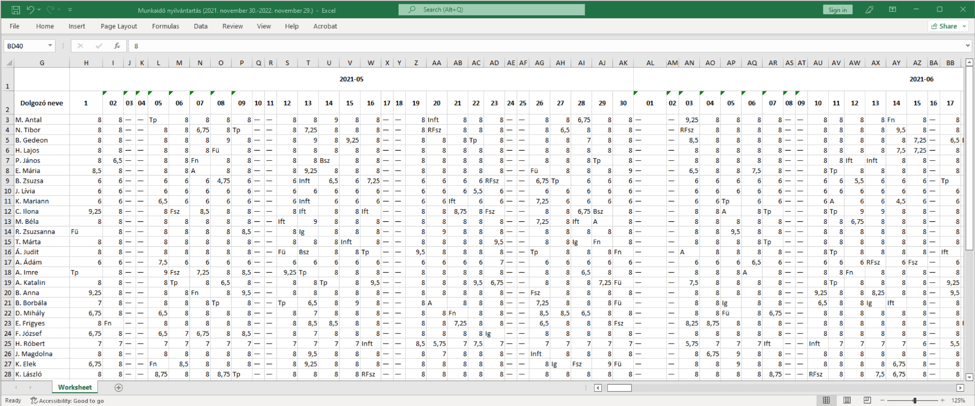
Paper-based or traditional spreadsheet-based data sets hinder the ability to make fact-based business decisions quickly.
03Solution
How might we
We should allow CTOs to easily see the current state of the organization's effectiveness in graphical form, filtered by multiple criteria and time intervals, so they can quickly intervene in business processes.
Business Goals
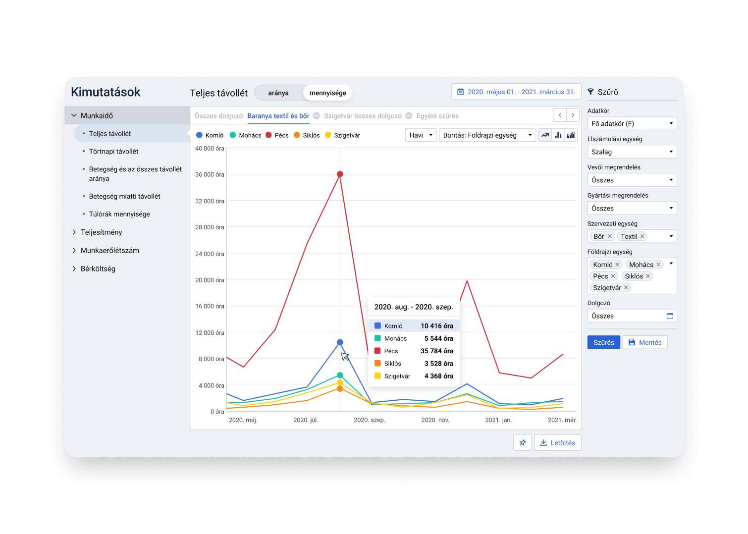
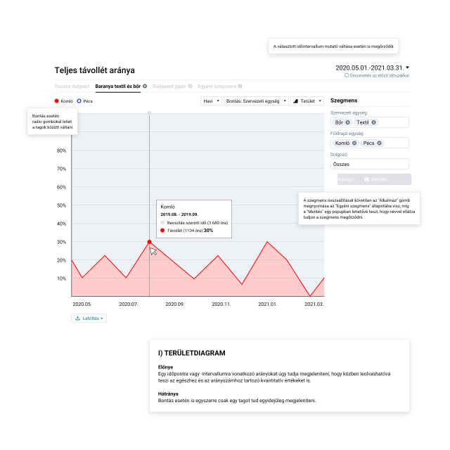
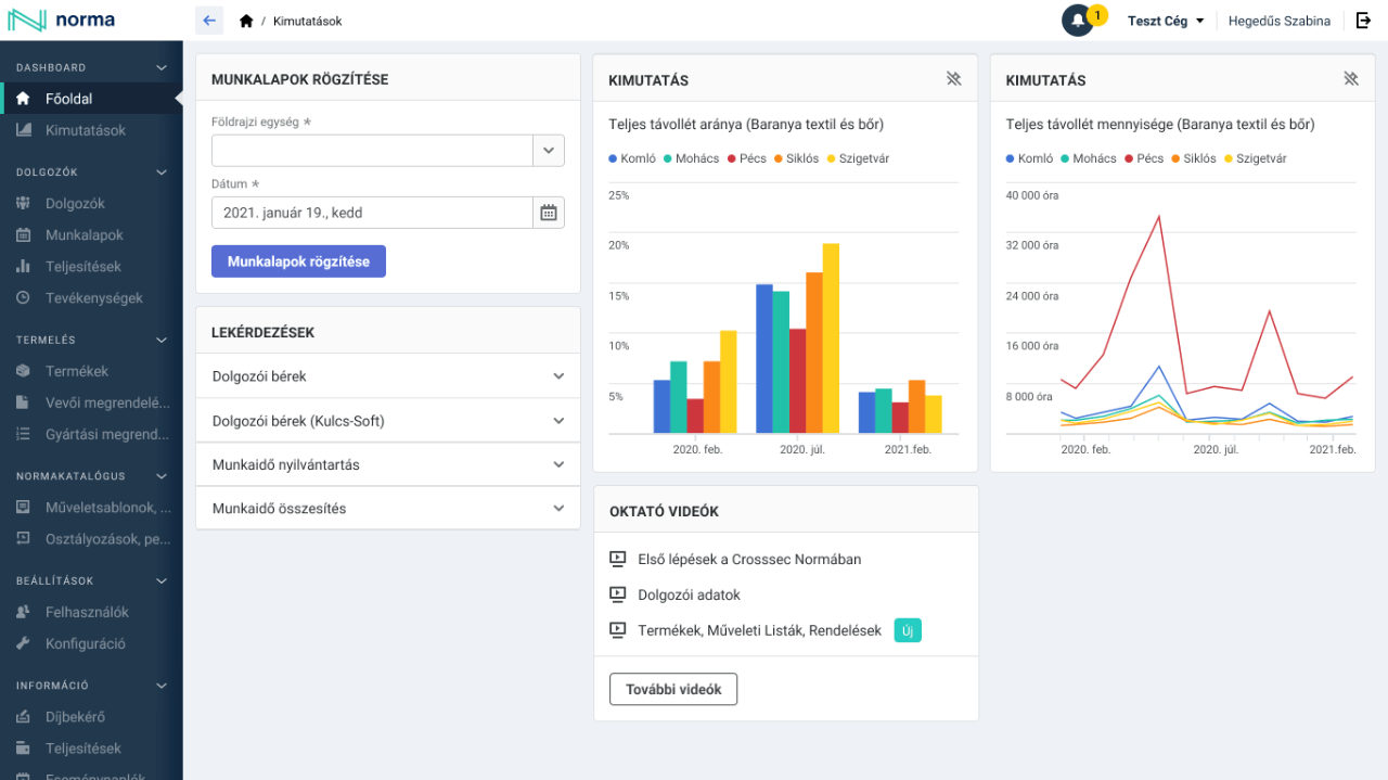
- Visualize key indicators related to staff numbers, working hours, output, and production.
- Relevant data context has to be easily accessible by the decision-maker.
Wireframes
At the beginning of the design phase, I created wireframes to see which diagram types would best visualize the indicators defined by the business. I set the essential user interface elements needed for the site.
During online workshops and meetings, we used wireframes to discuss ideas.
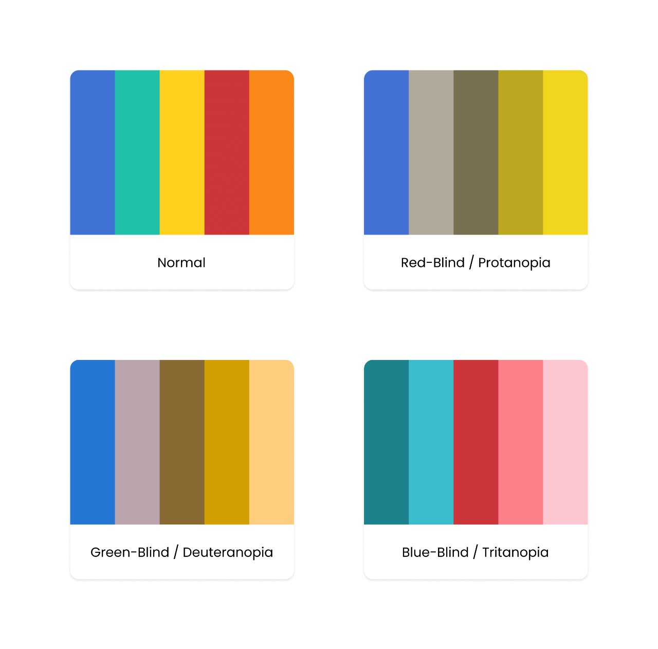
Accessibility
Color vision deficiency is the decreased ability to see color or differences in color. It affects approximately 1 in 12 men (8%) and 1 in 200 women. Color blindness may make reading data visualization more difficult, so I took particular care in selecting colors.
Design
After several iterations, I designed the user interfaces and prototypes.
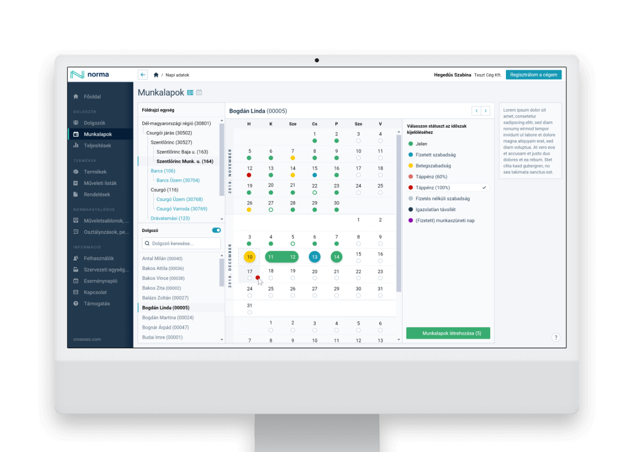
Accessible custom reports
There may be customized information that is often of interest to decision-makers. I designed the feature that allows them to pin their personalized reports to the home page to gain instant insights for quick decision-making.
04 Key learnings
Understanding the indicators
Undestanding the indicators of the four main categories (working time, labour costs, headcount, performance) was a key challenge to find the right graphical solution for data visualization.
Designing prototypes
Designing wireframes and prototypes was at the heart of the online discussions on possible solutions.
Accessibilty aspects
Data visualization needs a particular care of accessibility aspect of colors.